The world of thrillers thrives on suspense and this gripping energy should translate to the book cover as well. A well-designed thriller book cover can be a masterpiece of visual storytelling, luring readers in with a promise of mystery, danger and a thrilling adventure.
So, how do thriller book covers achieve this effect? Let’s delve into some key design elements:
Color Palettes:
Dark and Moody: Deep blues, blacks and grays are commonly used to create a sense of mystery and tension.
Bold Contrasts: Using a limited color palette with a pop of bright red or yellow can create a sense of urgency or danger.
Muted Tones: For a more psychological thriller, muted tones and washed-out colors can create a sense of unease and disorientation.
Imagery:
Silhouettes and Shadows: These can be used to create a sense of mystery and leave room for the reader’s imagination to run wild.
Close-Ups: A close-up of a character’s eye, a menacing weapon, or a cryptic symbol can pique curiosity and hint at the dangers lurking within the story.
Distorted Perspectives: Tilted angles, skewed lines and fragmented images can create a sense of unease and disorientation, reflecting the suspenseful nature of the story.
Typography:
Sharp Fonts: Sans-serif fonts with sharp edges can convey a sense of urgency and danger.
Sparse Text: Minimal text with a focus on the title and author’s name can create a sense of mystery and intrigue.
All Caps: Using all caps for the title can add a sense of urgency and drama.
Examples of Thriller Book Covers that Utilize These Elements Effectively:
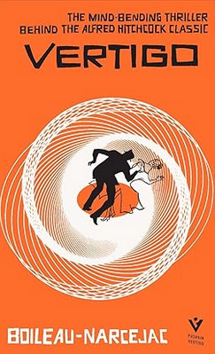
“Vertigo” by Boileau-Narcejac: This cover features a disturbing central image of a woman’s swirling form distorted by the perspective. This cover design for “Vertigo” by Alfred Hitchcock is a classic example of a thriller cover.
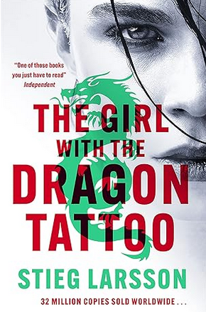
“The Girl with the Dragon Tattoo” by Stieg Larsson (2005): The stark black and white cover features a close-up of a young woman’s face with a single teardrop. The minimalist design is both haunting and intriguing.
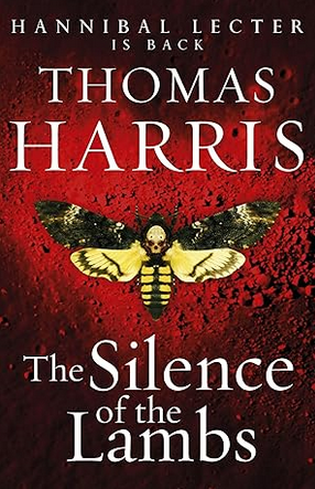
“Silence of the Lambs” by Thomas Harris (1988): This iconic cover features a death’s-head moth, a symbol associated with the serial killer in the story. The image is simple yet deeply unsettling.
Beyond these specific examples, here are some additional trends in thriller book cover design:
Negative Space: Utilizing negative space effectively can draw the reader’s eye to a specific element on the cover and create a sense of mystery.
Abstract Shapes: Geometric shapes and abstract patterns can add a sense of intrigue and unease, leaving the reader to decipher their meaning.
Gritty Textures: Rough textures like stone or weathered paper can create a sense of rawness and danger.
A well-designed thriller book cover should be more than just decoration; it should be an integral part of the storytelling process. By using suspenseful design elements, thriller book covers can entice readers and set the stage for a heart-pounding adventure.
Do you have a favorite thriller book cover? Share a picture and tell us why it works for you in the comments below!
Comments